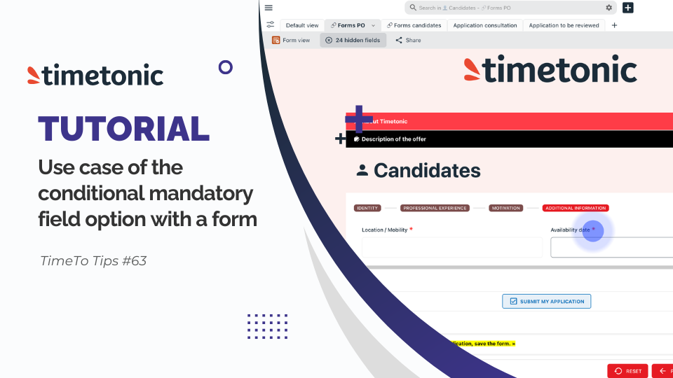
Cree un formulario personalizado con el nuevo editor WYSIWYG de Timetonic. Descubra cómo el nuevo editor WYSIWYG de Timetonic le permite crear formularios totalmente personalizados que se adaptan perfectamente a su carta gráfica y que puede controlar de principio a fin. Con este editor, usted controla todo: la estructura, el contenido, el diseño, la identidad de marca y la experiencia del usuario. Veamos ahora juntos cómo crear un formulario profesional en pocos minutos.
As a prerequisite, in this recruitment management space, I have a candidate's table. In this candidate's table, we will create our form and I have previously created a tab where I have set up the visibility of fields in advance and possibly the default settings in configuration before changing the type of view. Once the configuration of my parameters is finished, I will change the type of view to choose the form creation view. On the form creation view, I immediately see the available fields from the table presented in form view without. I'm going to click on the form configuration button to open the WYSIWYG form editor. An options window opens allowing me to choose the grouping mode of my songs or in grouped view accordion mode or step by step mode. in the editor the here I am finally in the editor. I'm going to spot different tabs. Here we have the tab to manage the page settings. Then I will have the block tab which allows me to insert sections and their content. I will find the tab of the fields that are available in my table. in the header tab the header settings of the form. the key and in the footer tab, the configuration parameters of the footer. Let's start by looking at the form's page parameters. I want to add a background color to the form so I have previously selected a color but I could directly make a color selection in this window. I apply my background color. Here, I have the possibility to add a space between sections, sections that I have not yet installed. And here, I'm going to add a space at the top of my form and on the side. Then, still in the form's page parameters, I'm going to go to the form's end of text, in which I'm going to customize the for the user. I'm going to add a message and I can go to the editor, possibly select a color on the text, different content, the background, the background color of this editor, but I'm not going to do it for the example, align the text, and possibly add a border to the paragraph field. Then, By clicking on this button, I can change the label of the button. So I'm going to paste a label to give more context to the user. I could add an icon before or after the text on this button so to the right or left of my text then adjust the height of my button adjust the alignment of my text the space on the sides or at the top or bottom of my button change the background color apply a border or I select the icon here that I could possibly modify with the icons available in the settings. Staying on this end of form submission view, I can go to the block tab and personalize this presentation by adding additional content for the form by directly selecting the elements and dragging them directly into the section. Then, if I click on add a logo for the cover, I get to the header block and I insert the company's logo. a cover for the header behind the logo. You can select the option that allows you to fix the header at the top of your form so that the user scrolls down, fixed at the top of the form and I exit the header block and I go to the block tab for we're going to use the group section. I click on the group to customize the settings and the name of the group. I insert in the group's header the name that I will give to this group and I can insert an icon before the text for this group I I leave the default value active to reduce the group, the user will have to click on the group to open it. In the available settings to customize my group sections, I can resize the width of my group, add a border, apply rounded edges, add a gap around my text, change the background color, color of the text, change the font size and and apply a column separation inside my group. I can apply multiple columns within a section, so that my fields added to the section could be side by side, like in the example just below the section, where the column is split in two. In our case, we will stay on a single column. I can apply space between my fields added to my section and and finally modify the background color of this section. I will close the section settings window to then insert a paragraph content in this section. I click on the paragraph content to open the setting window. In my editor, I will customize this paragraph with a picture. In the customization parameters, I could add a space in the outline of the paragraph, change the background color, align the text to the right or centered, add a border, or apply a rounded border. I exit this section and I will add a new group. The block is customized as before. I go to the field tab to find the field of my table that corresponds to the job description. I take the field and drag it directly into the group's section. If I'm wrong, I click on the arrow to remove the selected field and I select the field that I want to insert in this group. When selecting a field, I will have the parameters window that allows me to customize the appearance of this field on its background, on the text color, on the space around the text of the field and add a border or rounded edges. Then I go back to the block modules and I will add a section in which I will insert the name of my table. I will customize this section, by clicking on the field. the field parameters allow me to change the name of the table to add an icon next to the text to modify the level of presentation size of the name of my table. left, right or possibly centered, add a border or rounded edges. Then, let's move on to the construction step to customize the fields to be filled out by the user. We will select the section step by step. I will click on my section and thanks to this section, I will be able to categorize my fields by steps. I will customize each name of the steps. To add a second step, I click on the "plus" icon in the section and I add as many steps as necessary. To access the customization of the steps, I click on the step. Action. Then to respect the graphic charter, I will change the color background of the steps. This applies to all steps. If I wanted to delete one of the steps, I would just have to click on the cross above to remove it. And then, I can customize the borders of these steps. Then, the background color of the group, I will add some padding around the steps to have a little more space and make it visually more pleasant. and inside this section I'm going to put two columns. Now that I have created the categories that will group the fields of my form, I will insert the fields in the respective groups. To do this, I drag the field directly into my step. your fields in the section you want. have inserted all your fields in the section, you just have to click on the other section to continue to insert the fields that correspond to this step. Or if you prefer, if your fields are in your form but you want to retrieve them more simply from the tab of fields available in your table, delete all fields from the form area. easily identify them and drag and drop from the tab. You have a search field too to find the fields if you have many and make your search and conception easier. in the field tab, you will see absolutely all the fields created in your table, even those invisible in the restrictions you have configured. If you choose to insert a field that is invisible in your restrictions, when you save your form, you will discover the visible field. the restriction parameter has been modified and it is now editable. You can change the restriction if that is your wish. Of course, it's better to configure your visibility settings before you go to the form editor so that only the fields you want the user to fill out appear. If you can't find a field available in your table, here in the field tab, it's already inserted in your form section, just like before, if you select a field, go to its settings window and if you click on the section, you can adjust the settings to create space between your fields or add a gap around the section. change the background, add rounded corners, all the options that are offered to you to customize the design of your form. If I activate this option, I allow the user to skip the steps. Otherwise, he will have to finish each of the steps and then move on to the next one. Once my step section is configured and my fields are inserted, I can move on to the customization of the footer. In this footer, I can fix the footer at the bottom so that if the user crawls up or down, the footer will follow the scroll. also the width, the background color. the spaces around the buttons, I can add borders, add rounded corners and then customize the name of my buttons and the background color of the buttons as well. once I've finished customizing my form, I can click on preview to get a rendering of what the user will see in the form. I will therefore have the accordion groups that open and close. Here my job description field will be visible when the form is shared in the public link. I have the fields in each of my step categories. I can select different supports. a preview in tablet view or mobile view. By activating the form display option external, I allow the customization of this form to apply to the form modification view. which will apply in the settings of the configuration of the external form column modification from my table. I will be able to save the configurations of my form. I arrive in my view that gives me a preview of what the user will see concretely with the visibility of the job description and the form with the different steps. The form being finished, we are going to want to share it. To share it, click on Share, Share the form. Go to the editing options to customize the share. You can select a column in which a redirection URL is available in your table or insert a URL directly in this field, apply security with a captcha, activate authentication by the user's space before ID to protect your form and customize the preview of sharing this form by adding a title, a description and an image that will be highlighted on a card in a conversational space. Here is a preview of what customizing your link in a conversational space will look like. You can also insert this form with the integration code into your web spaces. you have the possibility to delete the sharing of the URL of the form view. By clicking on this button, a warning message tells you that if you delete this form sharing URL, it will no longer be available in the places where you shared it. If you renew a share, the URL that will be generated will not be the same as the first one so your links will have to be modified where you inserted them. And here's a preview of the form share on a public link. We have our company presentation tab. We have the presentation of the job description. Here, our tabs, we can close them and the candidate will be able to fill in his information on finally submit the form. the user arrives on the end message that we configured in the editor. in the case of the submission of the form in your internal environment to the organization. If the user has creation rights, at the end of submission, you will find the end message and this user will have the possibility to click on the button that will allow to create a new form. As you will understand, in a few minutes you can customize a complete, structured, modern, totally personalized form. With the new WYSIWYG form editor in Timetonic, the visual design ensures that what you create is what you get. It's your turn! Create your first forms now!